Top

GO APE
GO APE
Reframing outdoor experiences
Reframing outdoor experiences
via
Friendly Giants
for
Adventure Forest Ltd.
via
Friendly Giants
for
Adventure Forest Ltd.
Art Direction, Logotype
Art Direction, Logotype
2018
2018
GO APE
Reframing outdoor experiences
via
Friendly Giants
for
Adventure Forest Ltd.
Art Direction, Logotype
2018
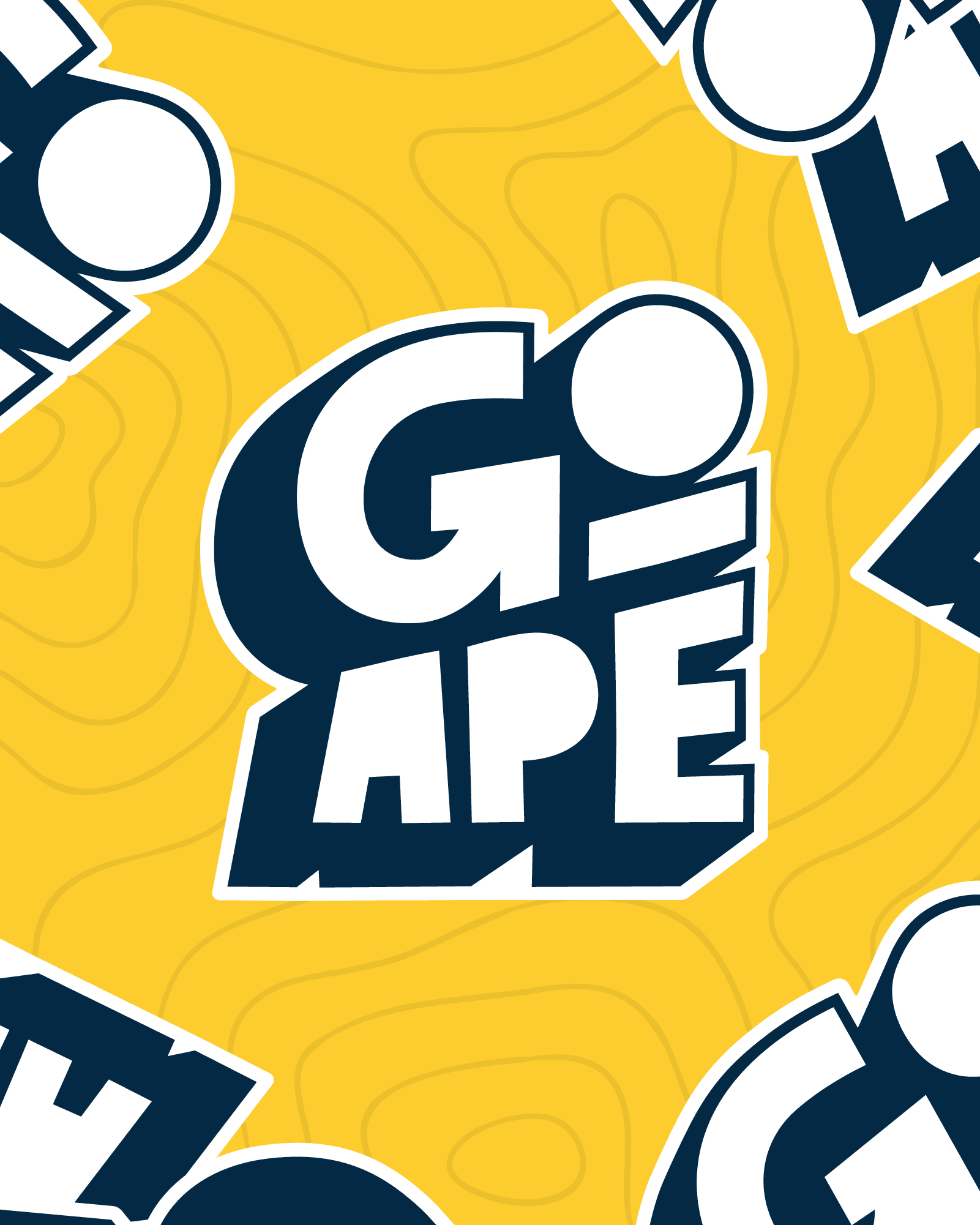
A bold new direction for the UK's number one forest adventure company. Brought in as a design lead to explore identity directions and craft a bespoke logotype, I worked with the team to establish the typographic style and shape language that would define the Go Ape rebrand.
CHALLENGE
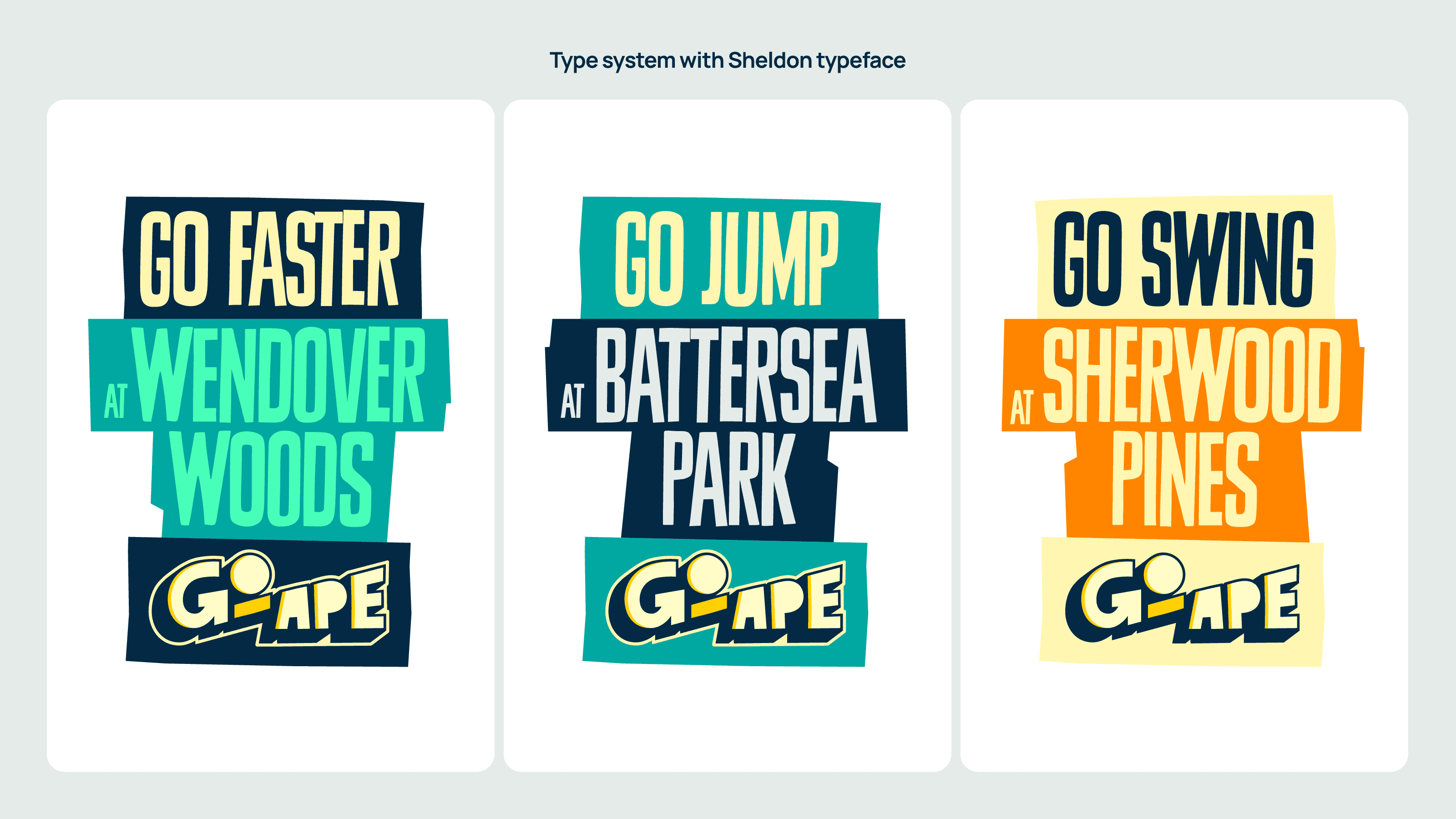
After 15 years, Go Ape needed a refresh to win back young adults and clarify their expanding offerings. The brief: one flexible master brand, badgeable across 30+ locations and sub-brands, without overcomplicating it. My role was to explore identity directions and craft a fresh logotype to steer the overall typographic style and shape language.
SOLUTION
Bespoke letterforms formed a versatile, bold, sticker-style master logo — with a stencil version usable on any background. An approachable, warm graphic style with playful patterns and a bold typographic system made brand-building easy and enjoyable for in-house teams across every location.
OUTCOME
Swift nationwide rollout and a substantial increase in participation from a younger audience.
CREDITS
Creative Director: Gavin Leisfield
Senior Designer: Jake Brewer
Designers: Jake Walton, Sarah Chadder
Photography © Go Ape


More work