Top


BBC Doctor Who
BBC Doctor Who
Redefining an iconic brand for a new era
Redefining an iconic brand for a new era
via
Littlehawk
for
BBC
via
Littlehawk
for
BBC
Art Direction, Logotype
Art Direction, Logotype
2018
2018
BBC Doctor Who
Redefining an iconic brand for a new era
via
Littlehawk
for
BBC
Art Direction, Logotype
2018
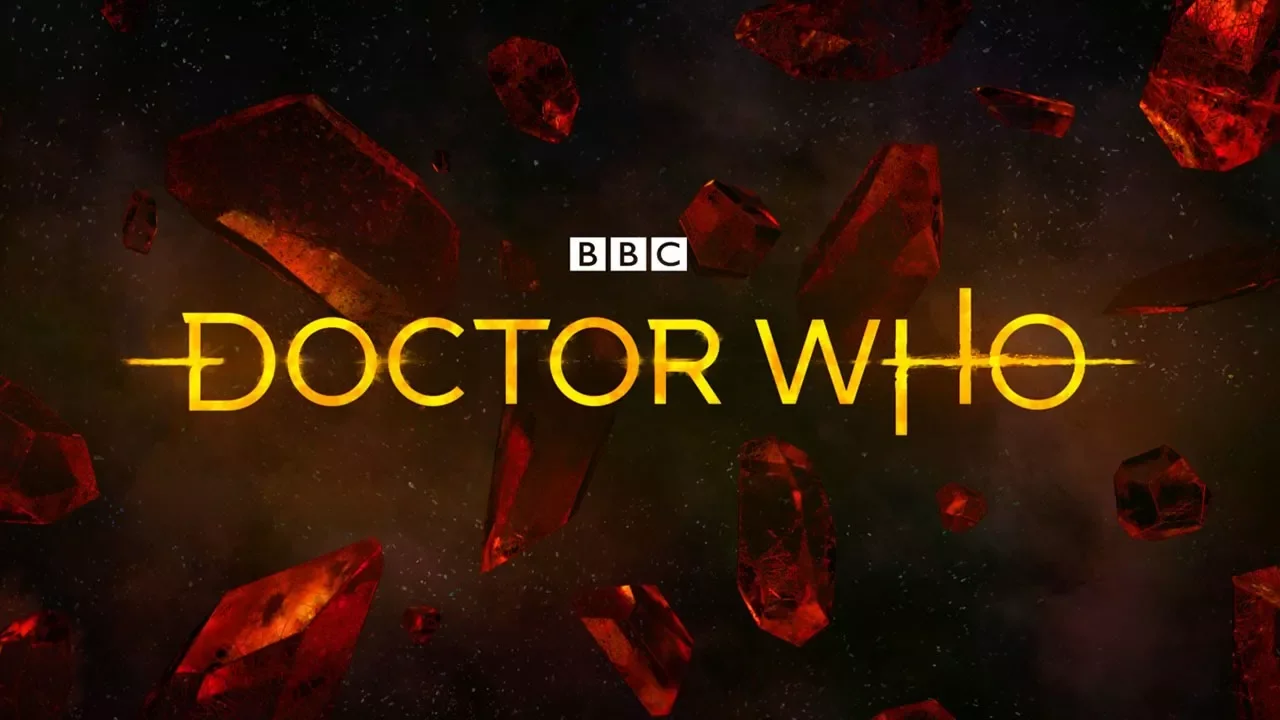
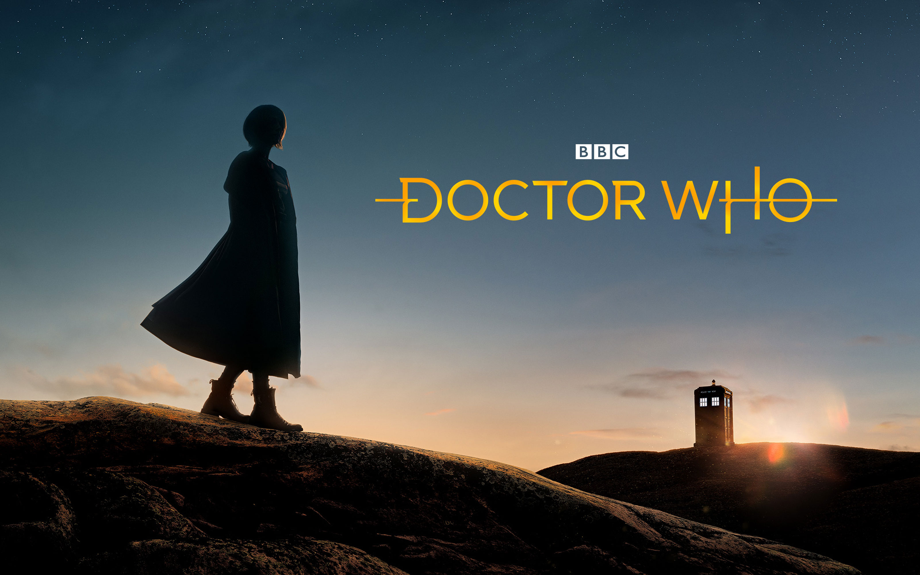
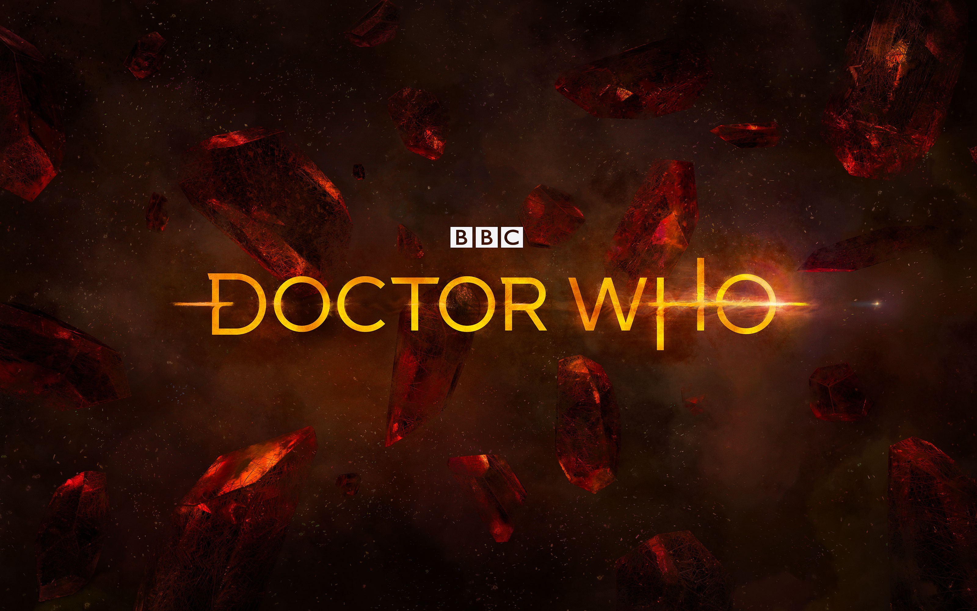
In 2018, BBC Studios set out to reimagine Doctor Who as a global franchise for a new era with Jodie Whittaker as the Doctor. Working closely with the creative director, I led the art direction — building a concept around the fabric, dilation and direction of spacetime. I crafted the logotype to bring those ideas to life in every letterform.
CHALLENGE
A show that constantly reinvents itself needed one identity to work across 44 years of history, understood across international markets, build on the existing brand equity AND keep legacy fans happy. Conceptually, how to break away from typical space-time aesthetics of wavy patterns, lights and stars?
SOLUTION
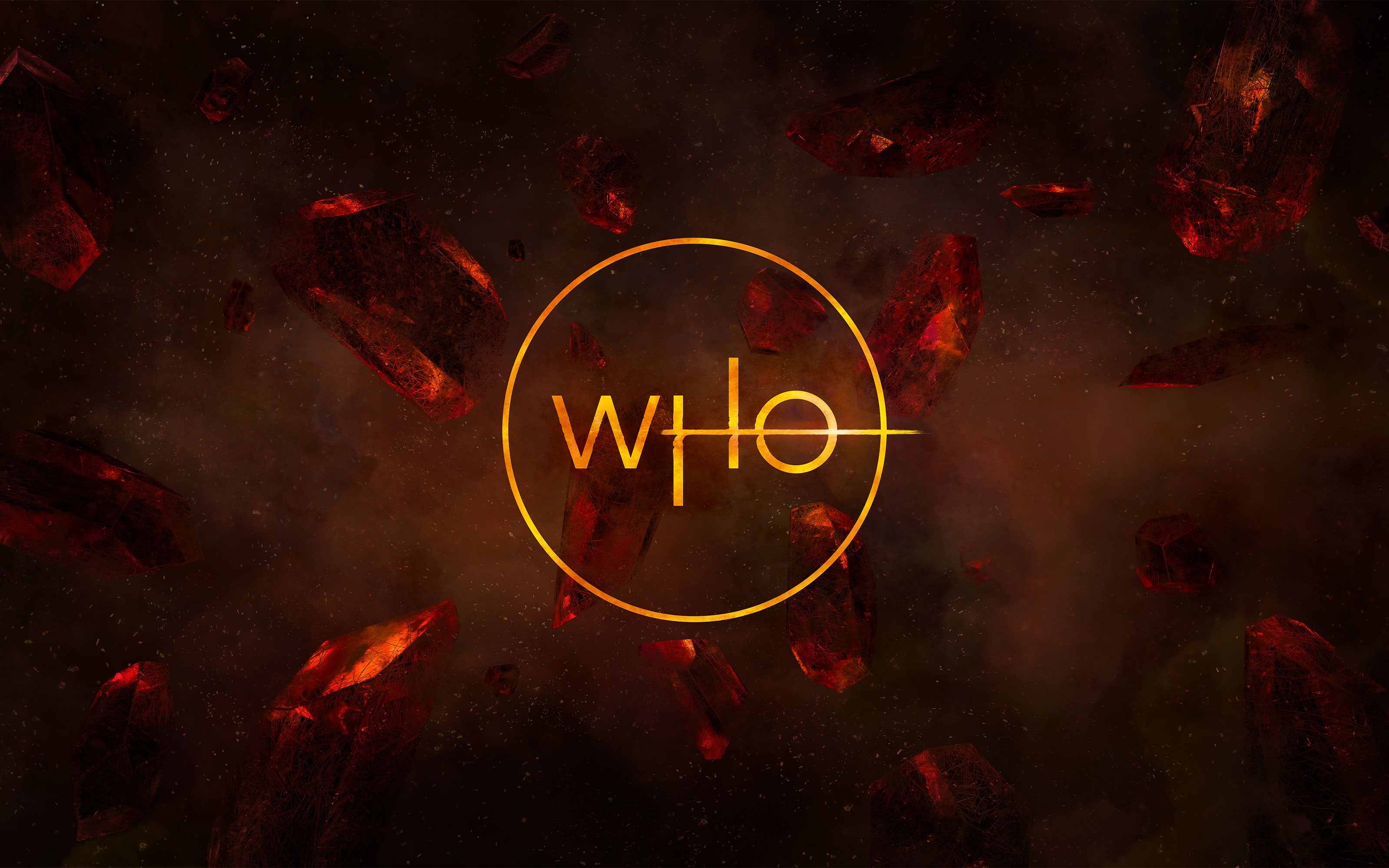
The question which led the art direction: what if space-time had texture you could actually touch? The logotype was built around momentum, with hidden characteristics woven into every letterform, designed to pierce through and break-apart space-time itself, fragmenting into crystal shards, which emerged as the visual language. Distortion and resonance as an alternative to the usual stars and wormholes. A standalone insignia reimagines the Whoniverse as a badge full of hidden details, hinting at the mysteries within.
OUTCOME
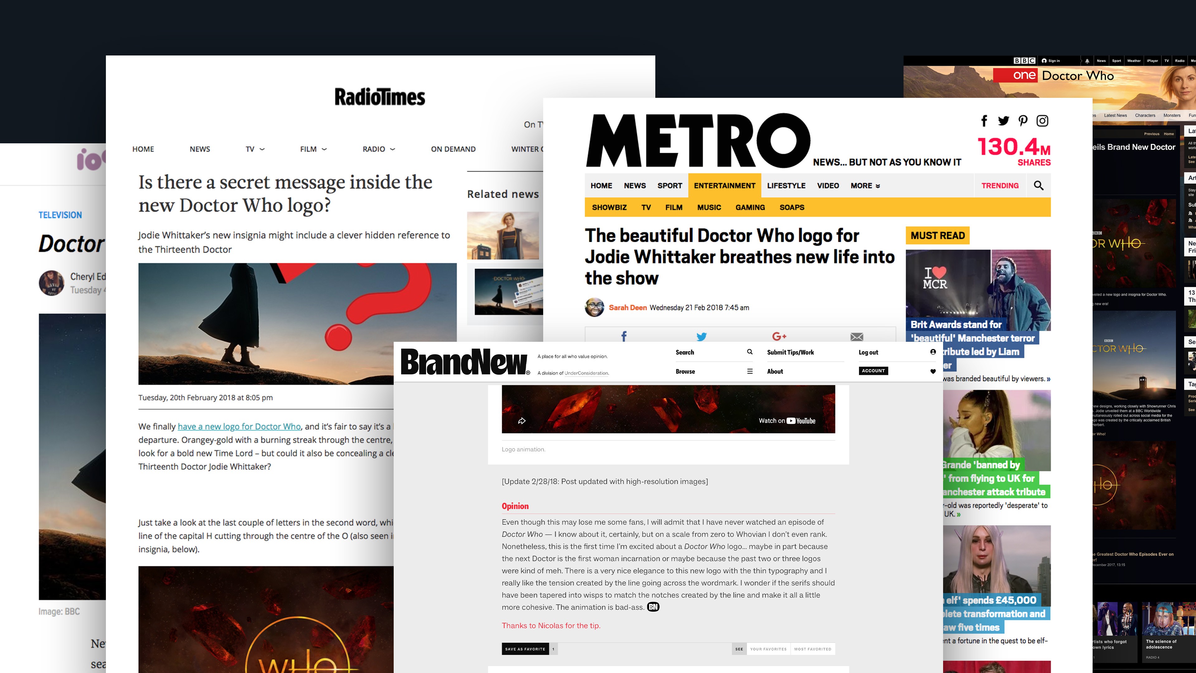
Launched to widespread critical acclaim, featuring in Brand New, The Standard, Gizmodo, Mashable and Creative Bloq. Fans immediately set about dissecting the hidden gems and debating over their meanings, creating many fun spin-off narratives. Happy fans, happy BBC, happy us.
CREDITS
Creative Director: Gavin Leisfield
Art & Design Direction: Jake Brewer
3D, Motion, Visualisation: Marcus Chaloner
Senior Designer: João Miranda
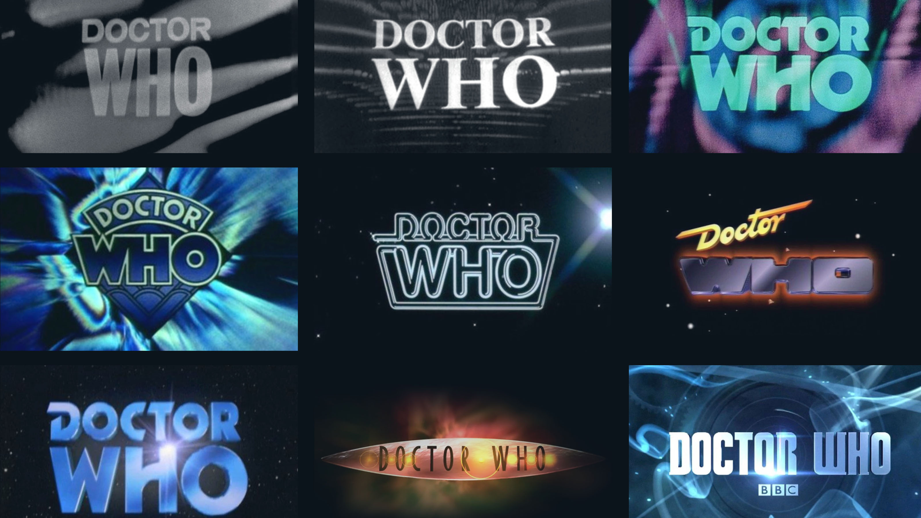
↑ The Doctor's logo history expands through time
↑ The Doctor's logo history expands through time
↑ The Doctor's logo history expands through time
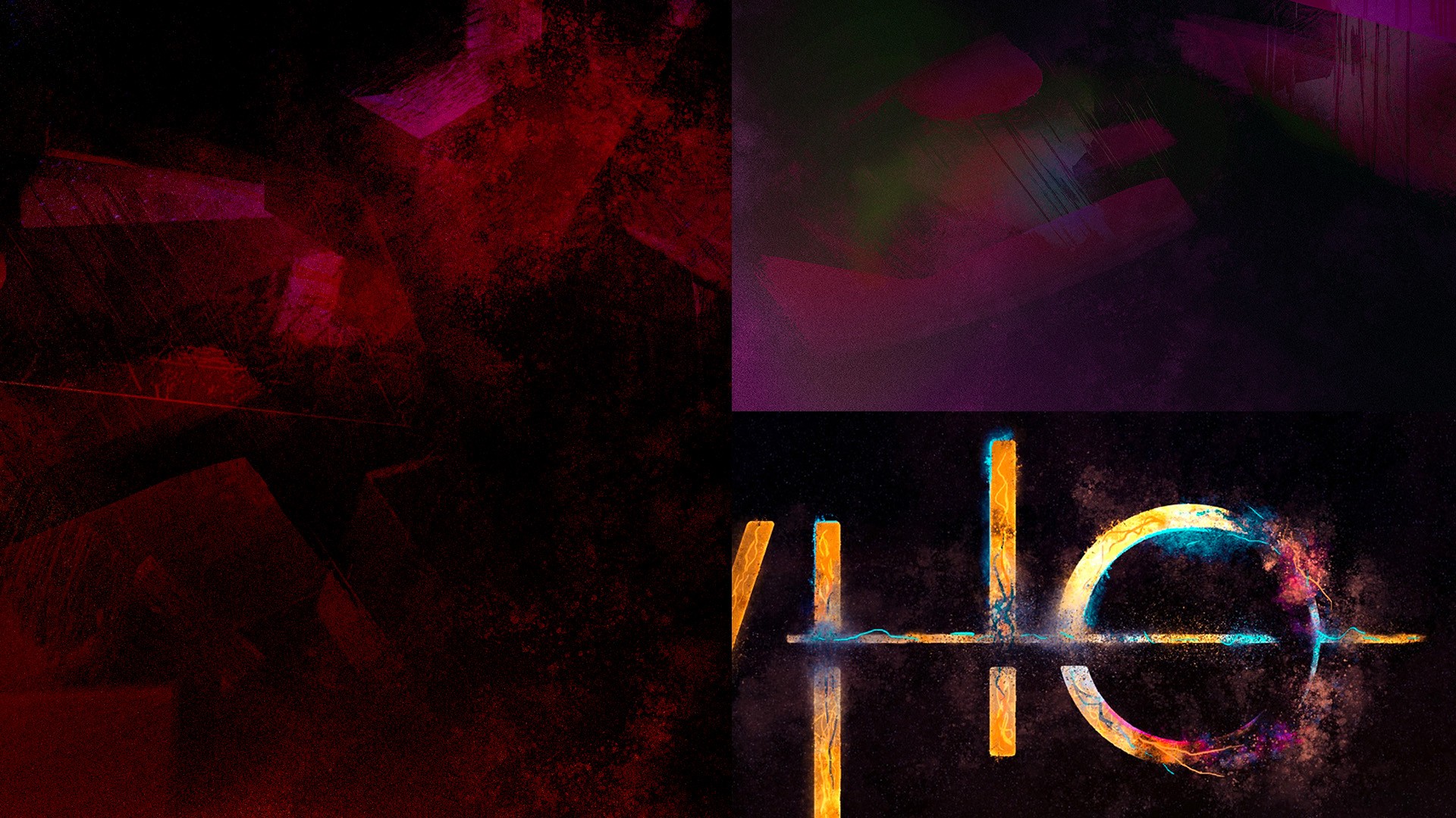
↑ Initial art direction and styleframe development
↑ Initial art direction and styleframe development
↑ Initial art direction and styleframe development

More work